
From Deck Photo to Finished Design: Capturing the Inside Passage
Many of our designs at Alaskan Cruise Shirts begin not with an idea on paper, but with a moment. A photograph taken from a ship's deck, a specific color palette from a glacier, or the way the light hits a certain fjord. Our aim is to distill those real experiences into something tangible. This process is particularly true for our
, where the sheer scale and intricate beauty of the Alaska waterway demand a thoughtful approach to every inside passage design.The Inside Passage isn't a single vista; it's a thousand shifting scenes, from narrow channels flanked by spruce forests to wide expanses opening to the Pacific. Crafting a design that speaks to this entire journey, rather than just one port, requires a careful eye for what truly defines the route. We want our apparel to echo the quiet awe you feel watching the landscape unfold.
Inspiration: A Photo Taken from the Ship's Deck
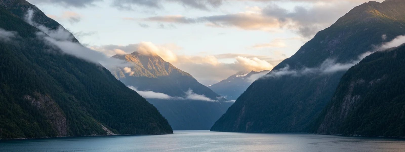
The genesis of a new design often starts with a single image. Imagine standing on the observation deck, perhaps somewhere between Juneau and Skagway, as the ship navigates a channel. The water is a deep, steel blue, reflecting a sky that's a blend of soft gray and the palest hint of sun. Dark green islands rise steeply, topped by a low, persistent cloud layer. This isn't a postcard moment in the traditional sense, but a real, atmospheric snapshot of the Alaska Inside Passage.
That initial photograph captures the feeling: the cool air, the vastness, the sense of moving through an ancient landscape. It's not about perfect clarity; it's about the mood, the layers of mist and mountain. This becomes our starting point, a visual anchor for the inside passage design we're about to create.
Identifying Key Elements: Fjords, Islands, Ports
Once we have that core inspiration, the next step is to break down the scene into its essential components. What are the defining visual elements of the Inside Passage? They include:
- **The Waterways:** The deep, winding fjords and channels, often appearing glassy and still.
- **The Islands:** Countless islands, large and small, densely forested with Sitka spruce and western hemlock.
- **The Mountains:** The coastal mountains that rise directly from the sea, often snow-capped even in summer.
- **The Ports:** The small towns like Ketchikan, Juneau, and Skagway, each with its own distinct profile against the natural backdrop.
- **Wildlife Silhouettes:** The occasional glimpse of a whale fluke, an eagle soaring overhead, or a bear on the distant shore.
These elements form the vocabulary of our scenic route apparel. We work to represent them in a way that is recognizable to anyone who has sailed these waters, without resorting to literal photographic reproduction. It's about capturing the essence, not every detail.
Translating a Scenic View into WPA Poster Style
The visual lineage of the 1930s WPA national-park posters is our guiding principle. This style is characterized by bold color blocks, confident typography, and a simplified, yet powerful, representation of landscapes and wildlife. To apply this to an inside passage design, we take our real-world photograph and begin to abstract it.
Complex textures become smooth planes of color. Individual trees merge into a pattern of dark green shapes. The subtle gradations of light and shadow are translated into distinct, graphic layers. This simplification isn't about losing detail; it's about emphasizing form and composition. The goal is a clean, impactful image that evokes the grandeur of the place in a timeless manner, much like the original posters did for parks like Yellowstone and Yosemite. This approach ensures our designs look as good in November at home as they do on a July deck.
For more on our artistic philosophy, read Why We Draw Alaska Like a National Park Poster (Our Design Story).
Map Motifs and Typography Choices
An effective inside passage map shirt doesn't just show points on a line; it conveys the journey itself. We often incorporate stylized map elements — the winding paths of the channels, the distinctive shapes of islands, the markers for key ports. These aren't precise navigational charts, but artistic representations that highlight the route's character.
Typography plays a crucial role in complementing the graphic elements. We select strong, legible typefaces that recall the vintage aesthetic of the WPA era. The lettering is confident, understated, and integrated into the overall composition, not merely placed on top. It helps anchor the design, giving a name to the vastness and guiding the eye through the Alaska waterway design.
Consider our
as an example of how typography and graphic elements combine to create a lasting impression. It's about more than just a date; it's about a moment in history rendered with a specific visual language.Color Palette for the Inside Passage
The colors of Alaska are distinct from other cruise destinations. You won't find bright tropical hues here. Instead, our palette draws from the deep greens of the forests, the cool blues and grays of glaciers and water, the subtle earth tones of rock and shoreline, and the occasional muted warmth of a distant sunset.
For our Inside Passage designs, we choose colors that feel authentic to the region. Deep forest greens, slate grays, and various shades of muted blue are staples. These colors are applied in bold blocks, a hallmark of the WPA style, creating a striking contrast that is both graphic and evocative. This careful selection ensures that our scenic route apparel feels true to the place it represents.
The Final Design Story
The journey from a deck photo to a finished inside passage design is one of refinement and intention. Each line, each color block, each letter is placed to evoke the feeling of being there. The final design isn't just an image; it's a narrative. It tells the story of the ship moving through the channels, the mountains standing watch, and the unique beauty of Alaska's coastal wilderness.
Our goal is to create a souvenir that transcends the typical gift-shop fare. We want you to look at your
or wear one of our and be transported back to the specific moments you experienced on the Inside Passage. It's about a piece of apparel that holds a genuine memory, not just a generic label.Connecting the Apparel to the Experience
We started Alaskan Cruise Shirts because we believed travelers deserved better than corny puns or generic logos. We wanted to offer something that would genuinely connect with the experience of sailing the Inside Passage. Our scenic route apparel is designed for the traveler who appreciates the nuances of the journey.
Whether it's a
with a subtle glacier motif or a cozy for those cool deck mornings, each piece is meant to be a wearable reminder of a truly remarkable place. It's the kind of souvenir you'll reach for long after the cruise, remembering the vastness of Glacier Bay or the charm of Skagway. That's what we mean by Alaska, worn well.The designs are meant to be conversation starters, quiet affirmations of a trip taken, and a testament to the enduring beauty of Alaska. They are for those who know the difference between a fjord and a sound, and who want a souvenir that acknowledges that understanding. This connection, from the deck photo to the finished design, is at the heart of what we do.

Published by Alaskan Cruise Shirts
Alaska, Worn Well
Frequently Asked Questions
What is the Inside Passage?
The Inside Passage is a network of coastal routes for ships and boats along the Pacific Northwest coast of North America. It stretches from Seattle, Washington, through British Columbia, Canada, and into Southeast Alaska. This protected waterway offers calmer sailing conditions and access to numerous islands, fjords, and port towns like Juneau and Skagway.
How do you capture the vastness of the Inside Passage in a design?
We capture the vastness by focusing on the defining visual elements and simplifying them into bold, graphic forms, much like the WPA national-park posters. This involves using strong lines and color blocks to represent mountains, water, and islands, conveying scale without overwhelming detail. The aim is to evoke the feeling of the immense landscape rather than reproducing it literally.
What kind of colors are used for Inside Passage designs?
Our Inside Passage designs utilize a palette inspired by Alaska's natural environment. This includes deep greens from the dense forests, cool blues and grays of the water and glaciers, and muted earth tones from the rocky shores. We intentionally avoid bright, tropical colors to ensure authenticity and a timeless aesthetic.
Are your designs specific to certain ports along the Inside Passage?
While many designs capture the overall spirit of the Inside Passage, we also create designs specific to individual ports like Ketchikan, Juneau, and Skagway, as well as natural landmarks such as Glacier Bay and Misty Fjords. Each design aims to reflect the unique character and visual elements of that particular location within the broader Inside Passage route.
Why choose the WPA poster style for Alaska cruise apparel?
The WPA poster style, with its bold color blocks, confident typography, and focus on natural beauty, offers a timeless and respectful way to depict Alaska. It avoids the fleeting trends of typical tourist souvenirs and instead creates apparel that feels like a classic memento, designed to be worn and appreciated for years after the cruise.
First Look at New Alaska Designs
New ports, new parks, new wildlife — get first access to every new alaska cruise shirt drop plus insider packing tips for the Inside Passage.