
The Challenge of Depicting Ice and Scale
Glacier Bay National Park is not just a destination; it is an experience of scale. The tidewater glaciers, some of them miles wide at their face, calve icebergs into the bay with a sound like thunder. Capturing this immense, dynamic environment in a static visual, especially for a Glacier Bay design, presents a unique challenge. How do you convey the cold, the deep blues, the sheer size of a place where ice dominates the horizon, all within the bold, graphic style of a 1930s WPA poster?
Our approach began with observation. We looked at historical photographs, geological maps, and countless hours of footage from the deck of ships sailing through the bay. The goal was to distill the essence of Glacier Bay National Park into a few confident lines and color blocks, ensuring that every element spoke to the grandiosity of the place without resorting to hyperbole. This required a careful balance of simplification and specific detail, a hallmark of effective Vintage Alaska Travel Poster Shirts.
Color Palette Selection: Blues, Whites, Greys
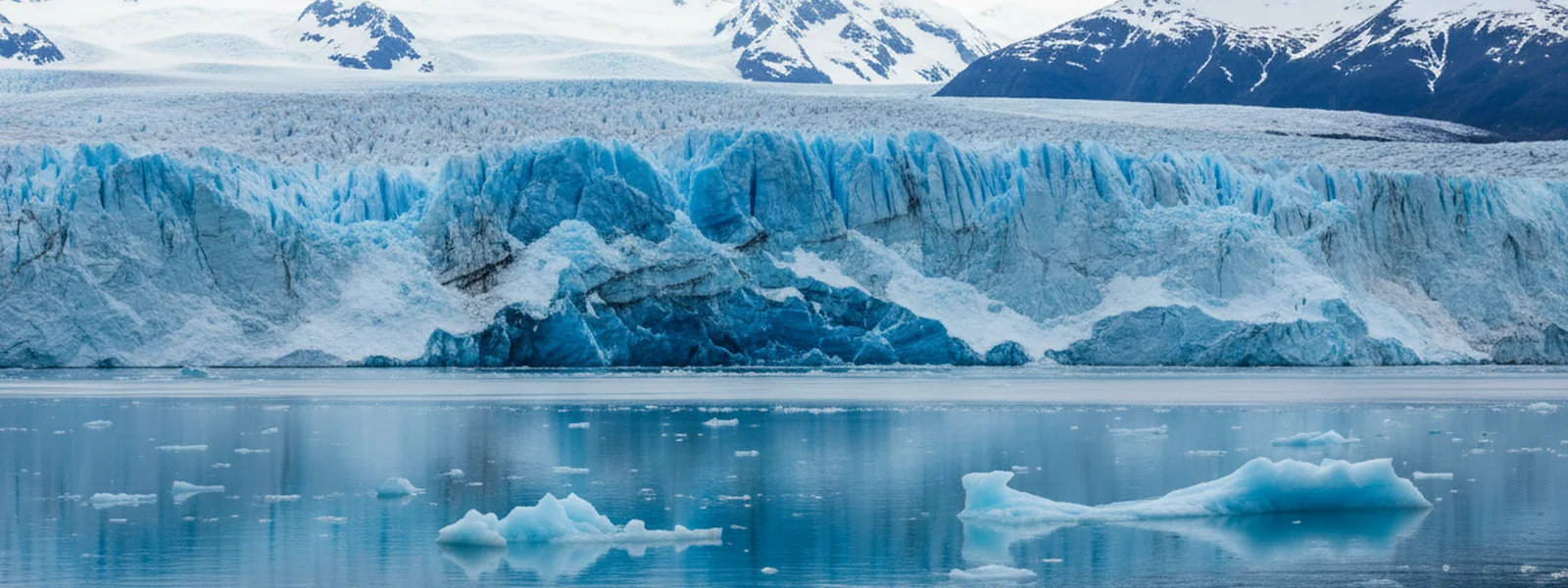
The colors of Glacier Bay are not subtle, but they are nuanced. The ice itself ranges from brilliant white where fresh snow has fallen, to deep, almost iridescent blues in the compressed ancient ice of the glacier faces. The water of the bay shifts from steely grey under overcast skies to a vibrant turquoise where glacial flour is suspended, reflecting the light.
For our Glacier Bay art, we focused on a palette that honored these natural variations while adhering to the WPA aesthetic. We settled on a spectrum of deep, muted blues for the ice, ranging from a dark navy to a lighter, almost ethereal blue that suggests depth and age. Whites and very light greys define the snowfields and the sky, while a subtle, darker grey or taupe often grounds the composition, hinting at the rocky moraines or the distant Fairweather Range. These choices allow the ice to be the star, reflecting the actual visual dominance it has in the landscape. Our
showcases this palette, emphasizing the quiet power of the ice.Incorporating Wildlife Elements: Whales, Seals
Glacier Bay is teeming with life, even amidst the ice. Humpback whales breach in the nutrient-rich waters, harbor seals haul out on floating icebergs, and puffins dart across the surface. Including these elements in the glacier bay design was essential to convey the ecosystem's vitality.
The challenge was to integrate wildlife without making it feel like an afterthought or a mere decorative flourish. The WPA style demands that all elements are integrated and simplified. For whales, this often means a bold, sweeping silhouette of a fluke or a surfacing back, suggesting movement and scale against the vastness of the water. Seals are often depicted as simple, rounded forms on ice floes, their presence a quiet counterpoint to the dramatic glaciers. This approach ensures that the wildlife feels like an organic part of the landscape, not just clip-art dropped in. You can see this integration across our Alaska Wildlife Shirts, where animals are always part of a larger scenic narrative.
Balancing Realism with WPA Poster Style
The core of our glacier bay design philosophy is to balance the recognizable features of the park with the graphic demands of the WPA poster style. This means:
-
Simplification of Form: Glaciers are complex, but we reduce them to their essential planes and angles, using strong, confident lines to define their edges and crevasses.
-
Bold Color Blocks: We avoid gradients and subtle shading, opting instead for distinct areas of color that create a powerful visual impact, much like the original WPA posters.
-
Iconic Motifs: Instead of photographic realism, we focus on iconic elements—the sheer face of a tidewater glacier, a distinctive mountain peak like Mount Fairweather in the distance, or the silhouette of a cruise ship navigating the bay.
-
Confident Typography: The text is an integral part of the design, often rendered in a strong, sans-serif typeface that evokes the era and serves as a clear identifier of the location.
This approach to alaska landscape design ensures that the artwork is immediately recognizable as Glacier Bay, while still retaining the timeless, artistic quality that makes it a souvenir you'll want to wear long after the trip. Our
, with its scenic backdrop, shows how a single graphic can capture a whole experience.The Final Design Choices for Glacier Bay Tees
When crafting the final glacier bay design for our tees, every element is considered for its impact and wearability. We want a shirt that feels good on the deck of a ship at 48°F, but also looks good back home in a casual setting. This means printing on high-quality garments, like our flagship Comfort Colors 1717 tees, which offer a garment-dyed, pre-faded look that already feels lived-in.
The chosen Glacier Bay art often features a prominent glacier face, perhaps with a small iceberg in the foreground to establish perspective. Distant mountains frame the scene, and the calm, yet deep, waters of the bay lead the eye. Sometimes, a subtle representation of a cruise ship is included in the foreground, acknowledging the primary way most travelers experience this incredible park. This is about creating a wearable memory, a piece of Alaska you can carry with you.
What the Design Aims to Evoke
Ultimately, our glacier bay design aims to evoke the quiet awe and profound scale of being in Glacier Bay National Park. It's not about shouting about the experience, but about reflecting the feeling of standing on deck, watching a piece of ancient ice calve into the water, or spotting a whale's fluke disappear below the surface. We want our shirts to be a conversation starter, a subtle nod to an unforgettable journey, rather than a loud declaration.
For the traveler who has seen the tidewater glaciers firsthand, our designs are a reminder of the blues of the ice, the stillness of the water, and the sheer power of the Alaskan wilderness. For those planning their trip, they offer a glimpse into the unique beauty that awaits them in this national treasure. This is tidewater glacier illustration as a keepsake, a piece of art that recalls the very best of the Inside Passage. Explore more designs that capture the spirit of the region in our Inside Passage Shirts collection.

Published by Alaskan Cruise Shirts
Alaska, Worn Well
Frequently Asked Questions
What makes Glacier Bay unique for a design focus?
Glacier Bay National Park is defined by its active tidewater glaciers, which calve ice directly into the sea. This dynamic interaction of ice, water, and wildlife, combined with the sheer scale of the landscape, provides a powerful and specific visual identity that lends itself well to graphic interpretation.
How do you represent the massive scale of Glacier Bay in a limited design space?
We use bold, simplified forms and contrasting colors to suggest depth and distance. By focusing on iconic elements like a dominant glacier face, distant mountain ranges, and small, recognizable wildlife figures, we create a sense of vastness without needing excessive detail. The WPA style itself thrives on this kind of impactful simplification.
What are the key colors used in Glacier Bay designs?
Our Glacier Bay designs primarily feature a palette of deep blues, stark whites, and various greys. These colors reflect the compressed ice, snowfields, and often-overcast skies of the region. We aim for a muted, earth-tone approach that feels authentic to the Alaskan environment rather than bright or exaggerated hues.
Do Glacier Bay designs include wildlife?
Yes, wildlife is an integral part of the Glacier Bay ecosystem. Our designs often include subtle representations of humpback whales or harbor seals, rendered in a simplified, graphic style. These elements are integrated into the overall landscape composition, adding life without detracting from the primary focus on the glaciers and scenery.
How does the WPA poster style influence Glacier Bay art?
The WPA poster style dictates a graphic, block-color approach with strong lines and confident typography. For Glacier Bay, this means reducing complex geological features to their essential forms, using distinct color areas to define ice, water, and sky, and focusing on a powerful, immediate visual impact rather than photographic realism.
What feeling does a Glacier Bay design aim to evoke?
A Glacier Bay design aims to evoke a sense of quiet awe and profound scale. It's meant to remind the wearer of the raw power and serene beauty of the Alaskan wilderness, the sound of calving ice, and the unique experience of navigating a landscape shaped by glaciers. It's a subtle, lasting memory of a significant place.
First Look at New Alaska Designs
New ports, new parks, new wildlife — get first access to every new alaska cruise shirt drop plus insider packing tips for the Inside Passage.