
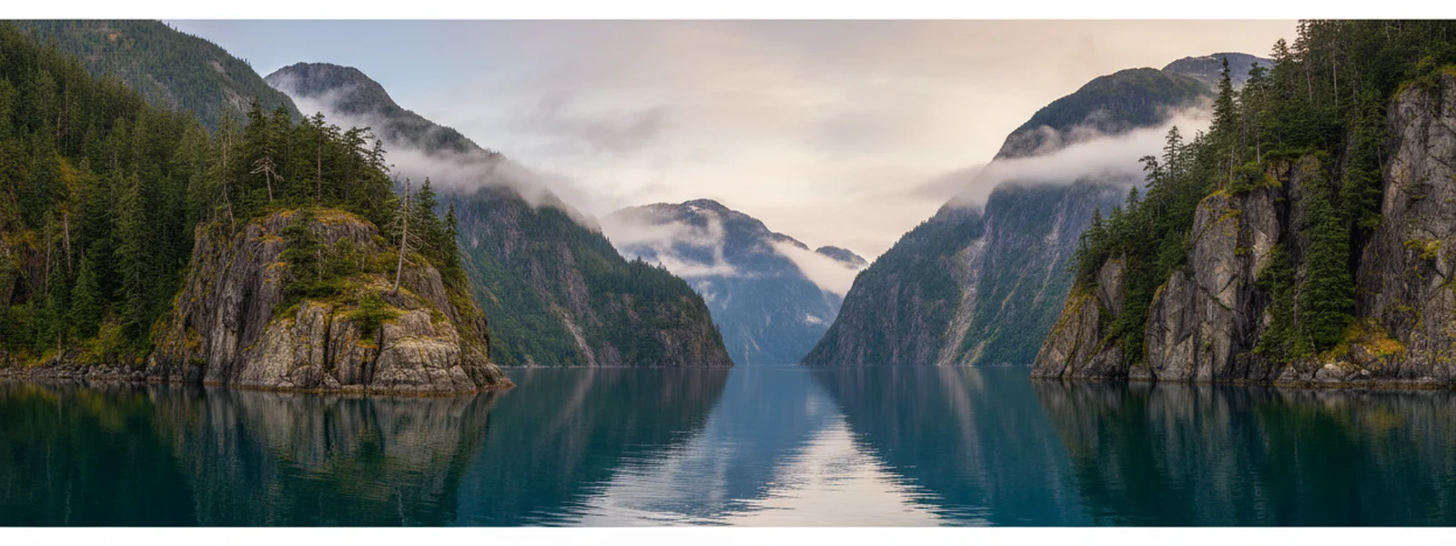
The Alaska Aesthetic: Muted Tones from the Inside Passage
When we started Alaskan Cruise Shirts on the deck of a Holland America ship, we knew what we didn't want: loud, brightly colored tourist tees. The Alaska we were sailing past was subtle, grand, and full of quiet power. It wasn't a place of primary colors, but of deep, shifting hues. This observation became the bedrock of our design philosophy, particularly our commitment to an earth tone alaska apparel palette.
Our goal has always been to create apparel that reflects the true visual character of the Inside Passage. That means embracing a palette that mirrors the landscape itself—the muted greens of coastal forests, the grays of a glacier-carved fjord, the deep blues of the sea, and the soft sands of a riverbank. These are the natural alaska neutral colors that define the region, not the artificial brightness often found in souvenir shops.
Avoiding the Tourist-Brights: Embracing Subtlety
Walk into many gift shops, and you'll find a riot of neon greens and electric blues, colors that rarely appear in the Alaskan wilderness. We chose a different path. The genuine beauty of Alaska lies in its understated grandeur—the way the light changes over a mountain range, the shifting grays of a rainy day, or the deep, dark green of an ancient spruce forest.
We craft our designs to be a quiet nod to the experience, not a shouted declaration. Our shirts are made for the traveler who appreciates the nuanced beauty of a place, the kind of person who remembers the specific shade of blue of a glacier's face, or the mossy green of a Sitka spruce. This deliberate choice allows our apparel to feel authentic, a true reflection of the environment.
Earth Tones and the WPA Poster Style
Our inspiration comes from the classic 1930s WPA national-park posters, a visual lineage known for its bold yet refined aesthetic. This style perfectly complements an earth tone alaska apparel palette. The WPA artists didn't rely on flashy colors to convey the majesty of the parks; they used confident color blocks and strong compositions to capture the essence of a place.
This approach allows our designs to stand out without being garish. The rich, deep colors we use—like the deep forest green or the slate gray—provide a canvas that feels both vintage and contemporary. It’s a deliberate choice to ensure our designs evoke a sense of timelessness, much like the original posters themselves. You can see this commitment across our
, where every piece aims for that classic, enduring appeal.Our Core Color Choices: A Landscape Reflected
We carefully select our garment colors to echo the Alaskan landscape. Here are some of our foundational choices:
-
Forest Green: Inspired by the dense, ancient rainforests that cling to the mountainsides along the Inside Passage, from Ketchikan to Glacier Bay. This isn't a bright, artificial green, but a deep, shadowed hue.
-
Sand/Natural: Reflects the rocky beaches, river deltas, and the lighter tones of exposed granite. It’s a grounding color, reminiscent of solid ground amidst the water and ice.
-
Navy: The deep, cold waters of the fjords, the vastness of the Pacific Ocean, and the twilight skies that hint at aurora. Navy is a staple that speaks to the maritime heart of Alaska.
-
Slate: The color of glacial silt, the overcast skies, and the sheer rock faces of the Chilkat Range. It’s a strong, neutral foundation that allows our WPA-style graphics to pop with subtle contrast.
These colors form the foundation of our `vintage alaska color palette`, ensuring that every shirt feels like a natural extension of the place it depicts.
Why These Colors Work on Comfort Colors Blanks
Our flagship
are a key part of this aesthetic. These garments are pigment-dyed, giving them a pre-faded, lived-in look right out of the box. This process creates a soft, almost sun-washed effect that perfectly complements our earth-tone designs.The `natural dye clothing alaska` feel of Comfort Colors blanks means the colors aren't uniform or overly saturated. Instead, they have a subtle variation that adds character and depth, much like a well-worn piece of gear that has seen a few Alaskan summers. It's the souvenir that already looks like it's been on a dozen trips. For example, our
on a Comfort Colors blank embodies this perfectly, offering a classic design on a garment that feels instantly familiar.Creating Apparel That Feels Authentic and Timeless
Our commitment to an earth tone alaska apparel palette is about more than just aesthetics; it’s about creating something that lasts. These aren't shirts you wear once and forget. They're designed to be worn well, both on the ship and back home in November. The muted colors ensure they integrate seamlessly into your everyday wardrobe, becoming a subtle reminder of your Inside Passage adventure.
Whether you're looking for a cozy layer for cool deck mornings or a comfortable tee for exploring port towns, our apparel is designed with practicality and longevity in mind. Consider our
, which pairs a classic design with a versatile color, perfect for layering under a jacket. Or perhaps a warm in a deep navy, ideal for watching glaciers calve in Glacier Bay. Our also exemplifies this blend of comfort and enduring style.We believe that a souvenir should be more than just a memento; it should be a wearable piece of the experience. By choosing colors that reflect the authentic Alaska, we ensure that every shirt tells a story without needing to shout. For more insight into our design process, you might find our article Drawing Glacier Bay: A Designer's Notebook on Capturing the Ice to be an interesting read, as it delves into how we translate these natural colors into our WPA-style artwork.
Alaska, worn well, means apparel that looks as good at home as it did on the deck, subtly reminding you of the vast, quiet beauty you experienced. That's the promise of our earth-tone palette.

Published by Alaskan Cruise Shirts
Alaska, Worn Well
Frequently Asked Questions
Why do Alaskan Cruise Shirts use muted colors instead of bright ones?
We choose muted, earth-tone colors to authentically reflect the natural landscape of Alaska. The region's beauty lies in its subtle, deep hues—the greens of the forests, the grays of glaciers, and the blues of the sea—rather than bright, artificial tones often seen in tourist souvenirs. Our palette is designed to mirror this understated grandeur.
How do your color choices relate to vintage WPA national park posters?
The WPA national park posters from the 1930s are a core inspiration for our designs. These posters used confident color blocks and strong compositions with a sophisticated, often muted palette to convey a sense of place. Our earth tones align with this vintage aesthetic, allowing our designs to feel classic and timeless rather than trendy.
What specific colors are most common in your Alaska apparel?
Our most common colors include deep forest green, inspired by coastal rainforests; sand or natural tones, reflecting rocky shores; rich navy, representing the deep ocean and fjords; and slate gray, echoing glacial silt and dramatic skies. These colors are chosen to directly reference the Alaskan environment.
Are your shirts made with natural dyes?
Our Comfort Colors blanks, which are a flagship product, are pigment-dyed. This process gives them a unique, pre-faded, and lived-in look that complements our natural, earth-tone designs. While not all garments use purely natural dyes, the pigment-dyeing process creates a similar soft, authentic aesthetic.
Will these earth-tone shirts look good back home, not just on the cruise?
Absolutely. Our design philosophy, 'Alaska, worn well,' means creating apparel that is timeless and versatile. The muted, earth-tone palette ensures our shirts integrate easily into your everyday wardrobe, allowing them to be a cherished keepsake that looks good whether you're on the ship or back home in November.
Do you have designs that specifically highlight different Alaskan landscapes?
Yes, our designs draw from a wide range of Alaskan landscapes, including Glacier Bay, Denali, Misty Fjords, and various Inside Passage ports. Each design uses our signature WPA-poster style and earth-tone palette to capture the unique character of that specific location, ensuring authenticity.
First Look at New Alaska Designs
New ports, new parks, new wildlife — get first access to every new alaska cruise shirt drop plus insider packing tips for the Inside Passage.